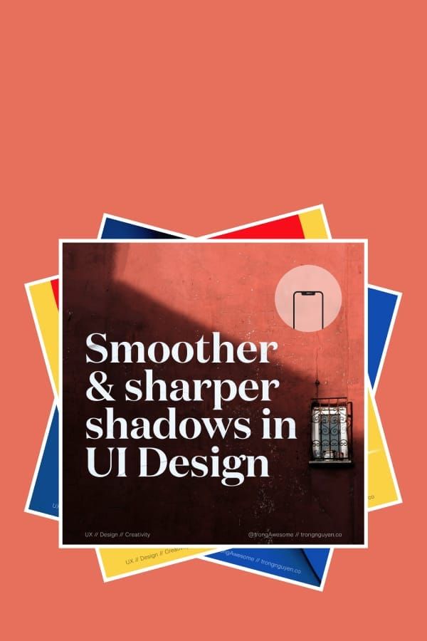
Ugly truths about design systems
Design system (DS) is not a temporary trend, it has many benefits to the organization and the product. But what else?
Welcome to Design Fundamentals! Explore creativity, problem-solving, and visual communication. Transform ideas into impactful solutions through hands-on projects.
Design system (DS) is not a temporary trend, it has many benefits to the organization and the product. But what else?
Design system (DS) is not a temporary trend, it has many benefits to the organization and the product. If you google “Design system”, there will be unlimited articles about why we should have a design system. Giant companies build their DS and share it with the world, Airbnb, IBM, Shopify,…
After spending a year on building DS at Carousell, here are what I’m facing when building it.
Consistency across the product and organization is the most important benefit of building a DS. We spend lots of time building it. Not only designers, developers, and PMs, but it’s also the whole company. We spend time creating something that we can use everywhere in any case.
It’s called design for scale.
But one solution can’t fit all. It’s the same for DS. We don’t know what we don’t know. We’re unclear about new problems we will face. Some new problems need new approaches. Anh DS doesn’t always fit.
I don’t like the phrase “Design for scale”. When we feed the scale monster, we will lose flexibility and optimization. We need the flexibility to adapt to the fast-changing world. We go global but need to localize.
“Treat DS as a product” means to continue updating, iterating like a product. But it’s a lie.
As a startup, we’re fighting every day to live. We use all of our resources to focus on the product, create new features, to improve and optimize for a better product. Who cares about updating a “product” that’s not so real like DS?
In a big organization, the product team is divided into different teams. And the product stays consistent due to the DS.
Different teams solve different problems. That’s why one component works for this team but not for the other. That’s the time designers sit together to discuss the change. But we also need engineers to be involved. But they are busy with their task, and their OKRs which are building DS isn’t included. Even updating DS is in their OKRs. We are not sure they want to do it, because we all agreed that was how the component works.
Changes are a reality, we always need to change DS either. That is to say involving and sharing why we should update the DS is very important.
Engineers will always ask us to use the components that were already built. There’s no wrong with that, their goals make it work and easy to maintain. They don’t like any things that are inconsistent and dirty code.
Designers will use what we have on DS for their designs. Sometime, the built components just can’t solve the problems. It’s good to work under constraints. But just after a big project, the product just goes wrong. You see so many things can be done better with some small changes. But when we want to change, the whole product will be impacted. We have a stack of dependencies on each design.
Locking design into a system makes it very hard to make something fast. And with a strict grammar system, we have less freedom to create something fun and surprising. When it’s not fun, it’s not design anymore.

What if one day you don’t have anything to deliver? It happens very often on a product team, what would you feel?
Wireframe, user flow, UI,… all deliverable of the designer. They are the results of our hard work. What if one day you don’t have anything to deliver? It happens very often on a product team, what would you feel?
Do you feel frustrated? Do you feel useless? Do you feel that you are redundant to the team and you would be…fired?
If your answer is yes. Yeah! You’re not alone. You get me. I felt very frustrated when I see the roadmap of my team that there are not many things for me to do work in the next three months, not many things to deliver.
Then I shared with my design manager about it got wisdom:
“Designer’s job is not only doing, but it’s also doing”
That advice reminds me of the designer’s job: solving problems. To solve problems, we need to know what the right problems are. I know it, we have to understand people how’s using our product. And the understanding just comes from talking and listing to them. That’s the time we nee dot do user research. And we need lots of time to plan for it.
We also need time to step back and think about what do we want to do for our product.
Designers are both doers and thinkers. And it’s our job. So next time when you don’t see you have enough things to deliver, it’s a good time for you to prepare for the next leap.

It’s your brain trying to protect you from harm, from coming up with ideas that is embarrassing and stupid and could cause you to suffer pain. The way you shut off is by forcing the brain to come up with bad ideas.
Now I understand why it’s very important for designers.
I used to work in a small start-up where I was the only designer, took care of the whole product design. I could decide the direction of the design and all the details. Sometimes, I had to sync with other departments, but not truly sharing, informing is more accurate.
Now, when moving to a bigger company with hundreds of people, twenty different teams and a dozen designers, sharing earlier is much more important than ever.
I, a shy designer, bad at convincing people. And I’m scared of sharing my works with other designers. Because I might not have a strong point of view about things - or I’m not confident to speak up. The other designers usually have strong opinions about better design, especially seniors or persons who’d stay for a long time at the company. They seem very convincing. And I often change the design based on their feedback, even sometimes, I don’t think it’s better. It makes me frustrated. Seems like I can’t fully control the design and not own anything.
Because of that, I don’t share so often.
One day, I have a new product manager, he’s interim, managing two teams at the same time. So I have to work with another designer - the other one of this team. Even though I own the product but it affects to her team, so we have to work closely together.
We did a talk to kickstart the project, discussed what we can do, what are the problem and how to move forward. I felt very well at it. I got useful insights from her previous user testing, and great advice not to spend a lot of time on it yet, things can change when syncing with other teams. We deiced to envolve another designer from another team also because it also relates to that team. We did another sync together, and plan that the next meeting, all of us will come with some ideas and discuss it.
It goes on like that. Everyone contributes to their ideas. We agree on the direction and move forward. Honestly, mots of the time, there are no big changes when brainstorming with them. The new design is 70% similar to the original that I proposed. but when involving them in the early stage of the process, I don’t convince them again. No surprise, not a big concern. Maybe, asking for feedback is just a way to convince people. and the value at Caoursell makes sense
“Over communication is better than under communication”
It’s doesn’t mean that we have to alk more, it’s about sharing more, share often, get people envolve earlier in the process.
That’s where collaboration becomes seamless.
Relates Find the way to raise your voice - Guide for shy introvert designer

One of the most basic and common principles of UX
In early 2018, Snapchat rolled out a major redesign. They launched a reformatted layout, which in turn confused users by making it difficult to access features they used daily.
It’s a drastic departure from previous designs and was supposed to make the app simpler to use. Unfortunately, a lot of people found it to be a confusing mess.

Old Snapchat

Redesigned Snapchat
They failed because they changed the designs that their users were familiar with. With the new release, users had to learn new things, and new behaviors. They broke their mental model. Then their users moved to the competitors: Instagram, Facebook who had copied the old Snapchat’s design & features. Snapchat ignored one common principle on UX: Jakob’s law.
What is Jakob’s law about? It states that:
“Users spend most of their time on other sites, and prefer your site to work the same way as all the other sites they already know.”
This principle encourages designers to follow common design patterns to avoid confusing users, which can result in a higher cognitive load.
Now let's go to some eCommerce websites: Amazon, Zappos, Flipkart, Lazada,… you will see their product detail page are almost the same: image on the left side, some key information with action buttons on the right, under is richer detail and related products.
They are the same, not because they copy each other. It’s because they know their customers use other sites and don’t want them to have to learn new things when coming to their website. They want the customers to find information as fast as possible by keeping the same structure. The faster customers get the product info, the higher their chance of purchasing it.
Then you can come up with the thinking: “Why are they so boring?” Yes! The similarity is boring. But remember that we’re designers and design for our users, not for us. We can think that those websites aren’t creative and boring. Customers come to a website with a purpose. A young man comes to Sephora.com to buy lipstick for his girlfriend, not to come to see how beautiful the website is.
Nowadays, all the popular tech companies turn their apps to a boring white color: Facebook, Twitter, Pinterest, Medium,… Why?
If we know Jakob’s law, it makes total sense. You might say that they are lazy and copy each other. No, they do it with a purpose, to help their customers use the app easier and focus on the content.
Then how do they differentiate from each other? Be different in small details.
We can play around with secondary colors that support the brand color, try different icon styles, pick a different font that aligns better with the brand or use a different tone of voice and many other details that we can do differently.
Day by day, hundreds of products are born. People will have more choices and more apps on their phones. That’s why we need the make the app simple. Using the most common pattern for our product helps customers use our product easier.
But don’t copy everything. Be creative on small details that will make us stand out.

There is a trend now on design, switching from Sketch to Figma. But is Figma that good?
Last month, when I wanted to create a prototype that when we scroll to a certain position, the CTA box will be sticky on the right side. I spent half a day on Sketch to find down how, but just disappointed. Then trying with inVision, but still impossible. I remember the time my co-worker asked me to join a Figma meetup about how to create a prototype. One idea sparks: “Why not try Figma to see how good it is?”
Ten minutes later, I made the prototype I needed in Figma. I was very surprised about how smart I was. I tried, and I succeeded. That’s a motivation for me to try more things with Figma.
I want to share my opinions after trying Figma with Sketch’s background. Both good and bad.
I’ve been a huge fan of Sketch for 3 years when switching from Photoshop because of the speed, performance, and no lagging while designing. Today, Sketch got so much bigger. Along with that is the decrease in their performance. It’s getting slower. If you work in a team that uses Abstract for version control and sharing libraries, it’s worse.
When trying Figma, my feeling is the same as when I tried Sketch while using Photoshop. The speed is so much faster.
With Figma, we still need to wait a bit to open the file because it needs to load the project from the cloud. After that, we can work smoothly without lagging, even with a big design file.
Figma doesn’t care bout colors or alignment when creating text style. In our Design System at Carousell, we have 7 different font sizes, so with Sketch, we created 7 font sizes x 2 font weights (regular and bold) x 3 text alignments x 10+ colors = 360+ text styles. One new color will add 36 text styles to our library. That makes choosing the text style difficult and takes a lot of time.
With Figma, 14 text styles are the maximum, we can have any color we want. It’s so much easier to use and maintain. This is the biggest difference between Figma and Sketch. And it makes sense.

Text style and color of design library in Figma vs. Sketch
Not only creating a simple prototype, but Figma also provides rich tools for creating many types of interactions and advanced animations.
Many products want to add as many features as possible to make them less dependent on other parts. And the consequence is a complex product, then the performance gets worse, Photoshop and Sketch are some examples.
It was also my first impression of Figma when knowing that that new tool combines design, prototype, collaboration, and hand-off in one product. After trying it with their prototype feature, I had to say: “Wow, that’s all we need to create a prototype.”
Figma has all behaviors for both web and mobile (all mouse events like hover, enter, click to tap, long press, swipe), from basic to advanced animation, and all real devices (iPhones, Android, iPad,…).
I want to nominate the best thing in prototyping with Figma is the way we create modal/pop-up interaction. First, we need a frame with actions that open the modal. Then we create a separate modal component. Then we add an interaction between the button and the component with the “Overlay” attribute then done. We created a full modal interaction that is open with smooth animation, and dismisses the modal by clicking outside.
The same method applies for pop-over, which you want it to be shown in a specific position. We can do it easily with the same flow.
They learn this feature very well from inVision. Brilliant!
I want to mention about the Smart animation that they’ve just released. We can create awesome animations as this guy did:

Face ID animation recreated with Figma’s Smart Animate
Sketch makes me lazy about creating prototypes, but Figma encourages me to create more prototypes which designers need to do more to show our ideas, instead of static images and slides. Because a prototype is worth 1000 meetings.
You can think of Figma as Google Docs for design. On Google Docs, people write, comment, collaborate and share text documents. Same on design for Figma. PMs, Engineers can come to the project, draw another button, change the headline copy, add their feedback or just add some notes to make the hand-off clearer.
PMs share with us their Google Docs so we can give our feedback. Why we designers don’t do the same? In the future, design is all about collaboration. The time for the only man designer is over.
And Figma has built on Web, makes it easy to share or embed design in any place like Jira, Influence, Trello,… Web is so powerful.
They are good things about Figma after trying it for one month. But it’s still young, it’s not perfect. There are many things they can improve on.
It doesn’t have a spread attribute for box-shadow, which CSS supports. Spread attribute help me create a beautiful box-shadow, or use it as a border because it doesn’t affect the size of components, then we will not face the flicking effect.
For example: with a text box, we have a normal and active state. I want to set the box in the active state to 2px border with a blue color. If we use the border in CSS, there will be lagging/flicking when switching between two states. We can solve it with spread attribute on box-shadow.
We can’t copy images from the web and past to a component. I do it very often in Sketch. Moving to Figma, I have to download all the photos to my machine then I can use it. Small but I really need to speed up my workflow.
Figma’s UI was noticeably unpolished, with low contrast and blind controls. It’s not very easy to spot the area to edit background color, border or effect. I have to look very carefully to find them.

In summary, moving to Figma seems like a better choice for big teams with many designers, engineers, and PMs. The cost is also cheaper when comparing with Sketch and its “partners” like Abstract for version control, Zeplin for hand-off and inVision for prototyping.
But test if yourself first. This sounds obvious, but no matter how exciting the new tool may seem in theory, you’ll never know if it’s the right fit for your org until you try it for real.
Don’t ever hesitate to throw out your old tools and come up with new ones.

We got so carried away with the idea of functionality, we lost sight of who we were designing for in the first place, humans
Last year, I got the first Fashion Magazine. LifeWear Magazine from Uniqlo. I got it as a free item. It’s a kind of catalog, but with a nice design.
There was an impressed section. It was called “Form follows function”. I knew about that principle before. But applying for fashion. It was just wrong.
I went through new designs that were designed by that principle. I loved it. Designs were minimal, like the way Japanese life. Minimal but fits the purpose.
But there was one feeling I had missed. The “Wow!”. I love the new designs and the concept. It was realistic. But for fashion, I expected more than that. A high standard aesthetic.

The same feeling you will get when you are in the tech industry. Where the principle “Form follows function” is even clearer.
“Form follows function”, it means an object should be designed according to its purpose.
We create new products, new features to solve problems. We, designers, design to solve problems. In a fast-moving world, we want to deliver as fast as possible. Some teams create good products with beautiful design. But most of the tech startup, beauty comes later. Where function is the first priority. And “Let make it work”.
We got so carried away with the idea of functionality, we lost sight of who we were designing for in the first place: humans.
Humans connect to the world through emotion. And design without beauty is void of emotion.
If we were to follow “form follows function” as a hard and fast rule, what would a clock look like? Its function is to tell time and nothing else. A designer might conclude that the simplest, fastest and most accurate way to show time would be on a digital display. Digital clocks are not particularly beautiful, though.
Analog displays are more aesthetically pleasing to most people. They aren’t quite as accurate, and people usually need an extra moment or two to tell the time, but they are generally nicer to look at.
Which clock above is best?

Rather than use “form follows function” as an inflexible rule, a better route would be to design our clock based on success criteria. If speed and accuracy are most important to the clock’s success, then a digital display would be best. If aesthetics are more important, then an analog display would be the better choice.
Ultimately, you have to determine the goals of your clock and how you will measure the success of those goals. What you come up with will lead you to your success criteria and design objectives. You could decide on an accurate digital clock for mass consumption or a work of art hanging in the terminal of a major railroad station.

People spend more time with products that they find beautiful, and they claim they are easier to use. The products seem to function better because they are beautiful. As in nature, function can follow form.
Steven P. Anderson speaks of the importance of aesthetics in design in his post on A List Apart. He notes:
“Researchers in Japan set up two ATMs, ‘identical in function, the number of buttons, and how they worked.’ The only difference was that one machine’s buttons and screens were arranged more attractively than the other. In both Japan and Israel (where this study was repeated) researchers observed that subjects encountered fewer difficulties with the more attractive machine. The attractive machine actually worked better.”
Perhaps this can be explained by the “halo effect”. A beautiful product triggers positive emotions that inform your judgment of its usability. The product does not necessarily function better, but you perceive it as functioning better because of its looks.
That’s the function of beauty.

Performance is a shared responsibility and everyone on your team impacts it. Considering performance when making design decisions will have an enormous impact on your users.
When we talk about performance, we often blame it on engineers. That’s their job to make the site faster.
Performance is a part of the whole user experience. A faster site will enhance the experience of users. But when they have to wait for half of a minute to see the page, they will leave.
If we, designers, want to design a good user experience, we have to care about the performance. We have many things to think about when it comes to design.
When we talk about performance, we’re talking about how fast the site load. We’ll aim to optimize for:
DoubleClick by Google found 53% of mobile site visits were abandoned if a page took longer than 3 seconds to load.
On another research, Akamai has reported that 75% of online shoppers who experience an issue such as a site freezing, crashing, taking too long to load, or having a convoluted checkout process will not buy from that site.
Another important impact of the performance is the impact on mobile users.
When we look at data from StatCounter Global Stats, we can see that mobile is steadily increasing as the total percentage of Internet traffic. At Carousell, 50% of user traffic is from mobile devices.
With the 4G connection nowadays, the connection speed is much faster than 3G. But the mobile connection is usually unstable. The webpage will take a longer time to load.
Performance is a shared responsibility and everyone on your team impacts it. Considering performance when making design decisions will have an enormous impact on your users.
Now, let’s see how we can design to have a better performing website.
Images make up the majority of most sites’ total page weight. Thanks to their relatively large file size and the number of images included on the average site, optimizing images are arguably the easiest big win when it comes to improving your site’s page load time.

So what is the right image format for the web?
In general, JPEGs are the ideal firm format for images on the web. JPEGs are good for photographs and images with a large spectrum of colors. JPEGs are lossy file formats. They are designed to compress files in ways that our eyes won’t notice at a high enough quality.
When we use the function “Save for Web” in Photoshop or using tools likes ImgOptimze to optimize JPEGs, we can improve further the performance and the file size.
With those tools, we can generate progressive JPEGs that load faster than the baseline JPEGs. Because progressive JPEGs fill in space with a low-quality version first, then load the high-quality version after. It affects the perceived performance of how fast your site loads. Meaning that your site seems to load faster with progress JPEGs.
But JPEGs don’t support transparency. What should we do? We can easily use PNGs. But PNG has a larger size than JPEG. It’s not good for performance.
If possible, try to use JPEGs instead. We can play with the background color a bit. If we use that image on a solid background, export the image in the same background color. That trick will work some time.
GIFs are one of the oldest graphic file formats on the Web. But the GIF format was not originally intended for animation like we see today. But thanks to its ability to include animation, it’s seen a resurgence in popularity. Today, you see GIF everywhere on the internet.
For digital products, web, and app, GIF isn’t the best choice. Especially when we talk about the quality and the file sizes. I wrote a very detailed article to talk about it here. Check it out if you want to know more
Even services like Giphy doesn’t even use the GIF file format themselves. Instead, they use HTML5 videos that are often as much as 90% smaller in size. Not only Giphy, Pinterest, Twitter also converted animated GIFs to Videos to improve their performance.
So if possible, try to Replace animated GIFs with Video in the browser.
To make a video act as a GIF on a webpage, we can cause a video file to act the same way using a handful of attributes.
<video autoplay loop muted playsinline src=“video.mp4”></video>
SVGs are becoming more popular nowaday. Thanks to the file size and the ability to resize without pixelating images in any screen types. And with SVGs, we have more controls.
If your icons or images in a single color, gradient or little detail, SGVS are a great replacement.
The major advance of using SVGs is that it displays beautifully in both retina and no-retina screen. Rather than creating high-resolution duplicates of your images to serve up to high-resolution display. Because SVGs are vectors and they scale smartly. Also, by replacing images files with SVGs, you eliminating an HTTP request to go and fetch the file from the server.
Another benefit of using SVGs is the ability to change to any color. We will provide one SVG icon file, then when using it, we can change to any color we want. For example, we can change to different colors for a normal and hover state for an icon in a button, with the same SVG file. If we use images like PNGs or JPEGs, we have to create two different images. One for the normal state, one for the hover. With SVGs, we can change it easily in CSS.
To optimize even further SVGs, try to use a tool like SVG Comporess. It can save 50% of file size.
The only disadvantage of using SVGs is browser support. IE8 and older don’t support SVGs. But IE8 is dead, replaced by a better browser Microsoft Edge. So check your date, if the number of IE8 users is small, go ahead with SVG.
The font you choose to use on your website will affect the loading time. Unless you use system fonts (fonts changes depend on the OS).
The good thing with system fonts is they are available on all devices. So the site doesn’t need to load fonts. Clearly, your site will load faster.
The bad things are … your site isn’t consistent across all devices and your site is almost similar to other websites. The typography is the same. Designers don’t like that way. Another thing is not all the system fonts are beautiful. Most of them are optimized for reading and working well in the OS but aren’t prioritized for the aesthetic.
So if we don’t want to use system font, there are two ways to use custom fonts: using an online web-font service and self-host web-font.
Online web-font services like Google font, Fontspring,… They have many choices and optimize for speed or loading time. But not all the fonts you love are available and free. Then you will consider to self-host your fonts.
With the self-host, we have to add file files to our source code. For example, if you want to use the font Circular in normal and bold styles, you have to add two different files: one is for normal, one for bold. We need those files in .WOFF (Web Open Font Format) to make sure the font is well rendered in different devices and browsers. If possible, we should include also the .WOFF2 files, a newer web-font format developed by Google, optimized for speed.
If we want to support more browsers like IE8 and older, we need more other file formats like .TFF, .OTF.
But keep in mind that the more file you include, the heavier your site, the longer time to load.
In a nutshell, if we’re only aiming to support modern browsers, include only .WOFF and .WOFF2. The CSS will be like this:
Copy 1@font-face {2 font-family: FontName;3 src: url(‘path/filename.woff2’) format(‘woff2’), 4 url(‘path/filename.woff’) format(‘woff’);5 font-display: swap;6}

Browsers support.
Once the font has been declared and defined, we can put it to use on our elements. For example:
Copy 1body {2 font-family: ‘FontName’, Arial, sans-serif;3}
Why do we need two web-font file format? Depend on the browsers, the most suitable font files will be loaded first. Meaning that when users use Chrome, the .WOFF2 will be rendered, but for Safari, the .WOFF will be rendered (.WOFF2 developed by Google, .WOFF developed by Apple). That way will make our site load faster.
The property font-display: swap; is to tell the browser that let use the fallback font while waiting for the custom font loads (in this case, it’s Arial). So we make sure that the text will be always available right after users load the site. After the custom font is loaded, the font will be swapped to the custom. It makes users feel the site load faster.
Using online web-font services or self-host are both fine. It depends on your usage to decide which one is better for performance. Sometimes, online web-font takes a longer time to load. Sometimes it’s faster. Check this article for more detail on when to use web-font, when to self-host your font.
You heard about it before. The term “Mobile first” has distinct meanings depending on the context.
When we talk about performance, a mobile-first approach forces you to consider our smallest screen sizes first. An approach in which you make hard decisions about functionality and content hierarchy at small screen sizes will help you keep your total page weight and the number of requests down.
For our responsive site, consider your smallest screen sizes first. Reorder your CSS to deliver small-screen styles first, and use progressive enhancement to add content and capabilities as screen sizes get larger.
Deliver correctly sized assets, and make the page’s core functionality interactive as quickly as possible.
From there, you can make decisions about how to share larger assets on larger screens, reflow content in your hierarchy, and continue to be deliberate about performance in your overall user experience.
By choosing the right image format, choosing the right way to host your font and approach the design and code with mobile-first, we finished the hardest part of designing for performance. But what else we can do?
In the next post, we will talk about human perception and how we can apply it to design to make the site perform better.

I got my job as a designer without going to design school. This is a guide to teach yourself design.
Product designer is a new term (not so new, but likely-new), and usually get confused with other roles like UX designer, web designer, app designer…
Who are they? And what are the differences between a product designer and a UX designer? Or nothing different?
And especially, how to get a job without going to design school? I got my job as a designer without going to design school. So, I’ll share my experience. Hopefully, it’s useful for someone who have just gots started in design or someone who wants to change career.
Have you ever heard somebody who called UX Designer, UI/UX Designer, Web Designer, App Designer, Product Designer, Interaction Designer,… and many more.
They are in different names, but the same. It depends on how companies call them. But at its core, they do the same thing:
Solving people’s problems.
Their favorite process is Design Thinking

They usually get started with four disciplines:
Know and practice these four and they will push you in the right direction.
Many years ago, when I started doing design, it started as a hobby and I learned everything by myself.
If you any product designer how they started at design. The common answer is:
“I learned by myself.”
The best designers I know are also self-learners. This is a guide to teach yourself design.
Always start with the foundation.
Learn basic drawing so you can be comfortable sketching with a pen.
Learn graphic design theory: color, typography, grid,…
Learn some basics in user experience. Those books help: The design of everyday things, don’t make me think.
Learn how to write. Without words, apps would be an unusable jumble of shapes and icons.
When you’ve got a foundation, you’re ready to learn tools.
We have so many tools. Start with a pen, paper, Figma, Sketch, Adobe XD,… Whatever you like.
You will explore more tools while you’re learning, and find the best that works for you.
Don’t copy from one, copy from many of them.
As you copy things, you’ll start to understand why the designers did what they did, what principles underlie their works.
You don’t need to go to a fancy design school. But you do need a solid portfolio.
It doesn’t have to be real projects. Make up your own side projects. Here are a few ideas:
This is critical.
Confidence gives you the courage to tell hiring managers why you’re worth it, what you’re worth, and what they are losing by not working with you.
Now go get your job.
Once you’ve got it, keep learning. We are all life leaner.

Lottie animation is easier than you think. In this post, we will create a Lottie animation, from After Effect to prototype to export handover files for developers.
Everyone knows about Lottie from Airbnb (I guess!), so we don’t need a long introduction here. Just a short one:
“Lottie helps us adding micro animation to the app much easier.”
Just ensure that we are not getting confused (like me in the past).

On this part, we will go through the process of creating a Lottie animation: From After Effect to export handover files for developers.
When you know the basics of After Effect, you just need to install a plugin, then use it to export the animation to your developers.
It’s easier than you think 😆
What do we need to get started with Lottie?
We need basic knowledge with After Effect (AE). Of course! If you don’t, I recommend watching some very basic AE animation to get started.
Then we need to install Bodymovin plugin in AE from github.com/airbnb/lottie-web. The easiest way is Option 3:
Go to Adobe After Effects (or Edit in Windows) > Preferences > Scripting & Expressions… > and check on “Allow Scripts to Write Files and Access Network”.
Now let create our animation.
Design your static illustration on Adobe Illustrator. (You can also do it on AE, but it’s easier to do in AI)

Create a new project in AE, doesn’t matter the size. Drag the AI file to AE. It will generate assets for us.

Lottie animation is based on shape. So we have to generate shapes from our asset. Tracing asset to shape: Right click on the .ai file -> Create -> Create Shapes from Vector Layer
Now animate them the way you want.
Support feature: solids, shape layers, masks, alpha mattes, trim paths, and dash patterns.
Checking airbnb.io/lottie for more features.

To export: Windows -> Externsions -> BodyMovin
Select your animation composition -> Select destination -> Render

Now we had a JSON file. Let’s test it in your prototype and send it to developers to add to the app.
To ensure the animation work the way we want, creating prototypes is the fastest way to make the development process go smoothly.
We need a JSON animation file. We can create one, or use one from lottifiles.com
I used the love animation from Aneesh Ravi.
P/S: Developers will use this JSON file to add animation to the iOS/Android app.

Drag JSON file to LottieFile plugin to load animation. Click “Convert to GIF”.

Create a frame, and insert the GIF. Adjust the size of the GIF to fit your design. Change the Blending mode to Darken to hide the white background in the GIF.

On the Prototype tab, create an interaction for the Like button to the GIF frame.
Select Open overlay -> Manual position -> Move it to the desired position.
Tips: Using arrow keyboards to move it so we can see the overlay background

On the GIF frame, adding an auto-go-back interaction to the main frame by selecting After a delay -> Add value (I use 1800ms)

Run prototype and test your animation. You can try my Figma prototype here and duplicate my Figma file here if you need.
Then just need to give the JSON file to developers and they can add animation easily.
Believe me, developers would love it.
Now, we’ll be looking at how to use Lottie to add animations to our GatsbyJS / React applications. (By the way, my site is running on GatsbyJS).
We can install it right into our current project, or create a new react app for testing with NPM or yarn module.
yarn add react-lottie
For more info, visit lottie web on Github
Let’s create our basic component structure!
But first, we will need to acquire a JSON animation. You can create yourself like the previous steps, or try some free files from Lottiefiles. All we need is a JSON file.
I placed it into a subfolder called asset-animation.
After importing lottie and our JSON file, copy-paste the code below:
import React, { createRef, useEffect } from "react";
import lottie from 'lottie-web';

import animationData from '../asset-animation/city.json';

const Lottie = () => {

  let animationContainer = createRef();
  let anim = null;

  useEffect(() => {
    anim = lottie.loadAnimation({
      container: animationContainer.current,
      renderer: "svg",
      loop: true,
      autoplay: false,
      animationData: animationData
    });

    return () => anim.destroy(); // optional clean up for unmounting
  }, []);

  function handleStop() {
    anim.pause();
  }
  function handleStart() {
    anim.play();
  }

  return (
    <Layout>
      <SEO pathname={location.pathname} title={"About me"}/>
      <Section narrow >
        <HeadingContainer>
          <div onMouseEnter={handleStart} onMouseLeave={handleStop}>
            Hover me
            <HeroHeading ref={animationContainer}></HeroHeading>
          </div>
        </HeadingContainer>
      </Section>
    </Layout>
  );
};

export default Lottie;
The code is pretty simple. We import the lottie module first and then the animation JSON. We define our animation div wrapper. Then in the useEffect, we invoke the animation using the loadAnimation() function.
The loadAnimation() method accepts the following parameters. All details in the The docs.
Okay! We are done, man! Now the animation is rendered as an SVG element on our website. View my file here →.
I have to say this, I love SGVs! And SVG animation is the greatest thing ever.
The guide above is very basic. But that’s a good foundation we can use animation on the web.
I believe that after you see how our animation runs on our website, you will be excited and create more, customize more to fit your taste.
As a designer, I thought it was impossible, or it would take months to do it. But when I decided to do some research and try it, it’s easier than I think. Yeah, humans, we often exaggerate the fear.
Okay! It’s the complete guide for Lottie animation. From creating it to implement it to a website (I guess the same for iOS / Android / React Native).
Looking forward to seeing more micro-interactions on the web and any apps. Because it’s delightful.

Some companies will have a whiteboard design challenge. I will have one session next week. It will be a case studies presentation and whiteboard challenge.
So I need to prepare and practice the whiteboard challenge to master it. I've never done it before. I need to do some research. Here are what I learned.
This is a step by step guide to help you run a whiteboard challenge smoothly.
The whiteboard challenge's primary goal is how you approach a problem and how the candidate works with others as a designer.
First, we need to know what interviewers are looking for when doing this exercise.
Good luck!
STAR interview method is a powerful tool that product designers can use to showcase skills during job interviews.
The STAR interview method is a technique used to answer behavioral interview questions.
STAR stands for Situation, Task, Action, and Result.
This method is used by many employers to assess how well a candidate has handled specific situations in the past, as a predictor of how they may handle similar situations in the future.
After being laid off, I went through numerous job interviews. I found it helpful to organize my answers to the interviewers' many questions using the STAR method.
In this post, I will help you to organize good answers to prepare for product design interviews with STAR method.
Firstly, it provides a structured way to answer behavioral questions. This can help you organize your thoughts and present them in a clear and concise way.
Next, it highlights your experiences. By sharing specific examples or your past experiences, you can demonstrate your relevant experience and expertise to employers.
Then, it shows your good communication skills. The STARR method requires clear and effective communication, which is important for any job. By using it, you can demonstrate your ability to communicate effectively and concisely.
Finally, it builds your confidence. The more you prepare, the more confident you are. Having a structured thought help you feel more in control and less nervous.
Subscribe to continue reading
Simple design speaks volumes. A minimal website isn't about less, but about making room for what truly matters—your story and work.
In a world of flashy animations and complex designs, there's something remarkably powerful about simplicity.
A minimal personal website isn't just a design choice—it's a statement about clarity, purpose, and respect for your visitors' time and attention.
Think of your minimal website as a perfectly brewed cup of coffee—no fancy syrups or toppings, just pure, distilled excellence.
Here's why embracing minimalism in your personal website makes perfect sense:
Let Your Work Breathe Your projects, writing, or artwork deserve center stage. A minimal design creates the perfect gallery space where your work can speak for itself. No competing elements, no distracting backgrounds—just your achievements in their purest form.
It's like hanging art in a gallery with clean white walls; the focus stays exactly where it should be.
Every additional feature, animation, or heavy image is another reason for someone to leave. A lightweight, minimal site loads instantly, showing respect for your visitors' time. In an age where attention spans are precious, this immediacy is priceless.
While complex designs come and go, minimalism remains eternally relevant. A clean, simple website won't look dated next year or need constant redesigns to keep up with trends. It's like a well-tailored black suit—always appropriate, always professional.
When you strip away the unnecessary, what remains is your message in its clearest form. Your visitors instantly understand who you are and what you offer. No hunting through elaborate menus or waiting for animations to finish—just pure, direct communication.
A minimal website is like a tiny house—everything has its place, and maintenance is straightforward. No complex features to break, no elaborate systems to update. You can focus on what matters: creating and sharing your work.
Simple designs naturally adapt better to different screen sizes. Your minimal site will look just as impressive on a phone as it does on a desktop, without fighting against complex layouts or oversized images.
Remember: Your website isn't about showing off your design skills (unless you're a designer). It's about creating a platform that serves your visitors and presents your work effectively. Sometimes the most sophisticated choice is to keep things simple.
Your minimal website should feel like a breath of fresh air in a cluttered digital world. It's not about what you add—it's about what you mindfully choose to leave out. When in doubt, ask yourself: "Does this element serve my visitors or just my ego?"
The best personal websites are those that get out of their own way and let the work shine. So strip away the unnecessary, focus on what matters, and create a space that serves both you and your visitors with elegant simplicity.
Start simple. Stay focused. Let your work speak volumes.
Your future visitors will thank you for it.