Style Guides
Headings
Headings are used in a blog website to structure and organize the content of individual blog posts.
They help break down the text into sections and highlight key points, making it easier for readers to navigate and understand the blog post's main ideas.
Headings play a crucial role in enhancing the readability and user experience of the blog, allowing readers to quickly grasp the topic and find the information they are looking for.
Heading 1
Heading 2
Heading 3
Heading 4
Heading 5
Heading 6
Styled text
Styled text is used in a blog website to add emphasis, highlight important information, and improve the visual appeal of the content.
It allows the author to apply different formatting styles such as bold, italic or underlined text to create a more engaging and visually appealing reading experience.
Lorem ipsum dolor sit amet, consectetur adipiscing elit, sed do eiusmod tempor incididunt ut labore et dolore magna aliqua.
Lorem ipsum dolor sit amet, consectetur adipiscing elit, sed do eiusmod tempor incididunt ut labore et dolore magna aliqua.
You can also use markdown to highlight the important thing
Button
The button element in Zenith provides a powerful tool for driving user interaction and engagement. The button can be left aligned or centered.
Sign up card

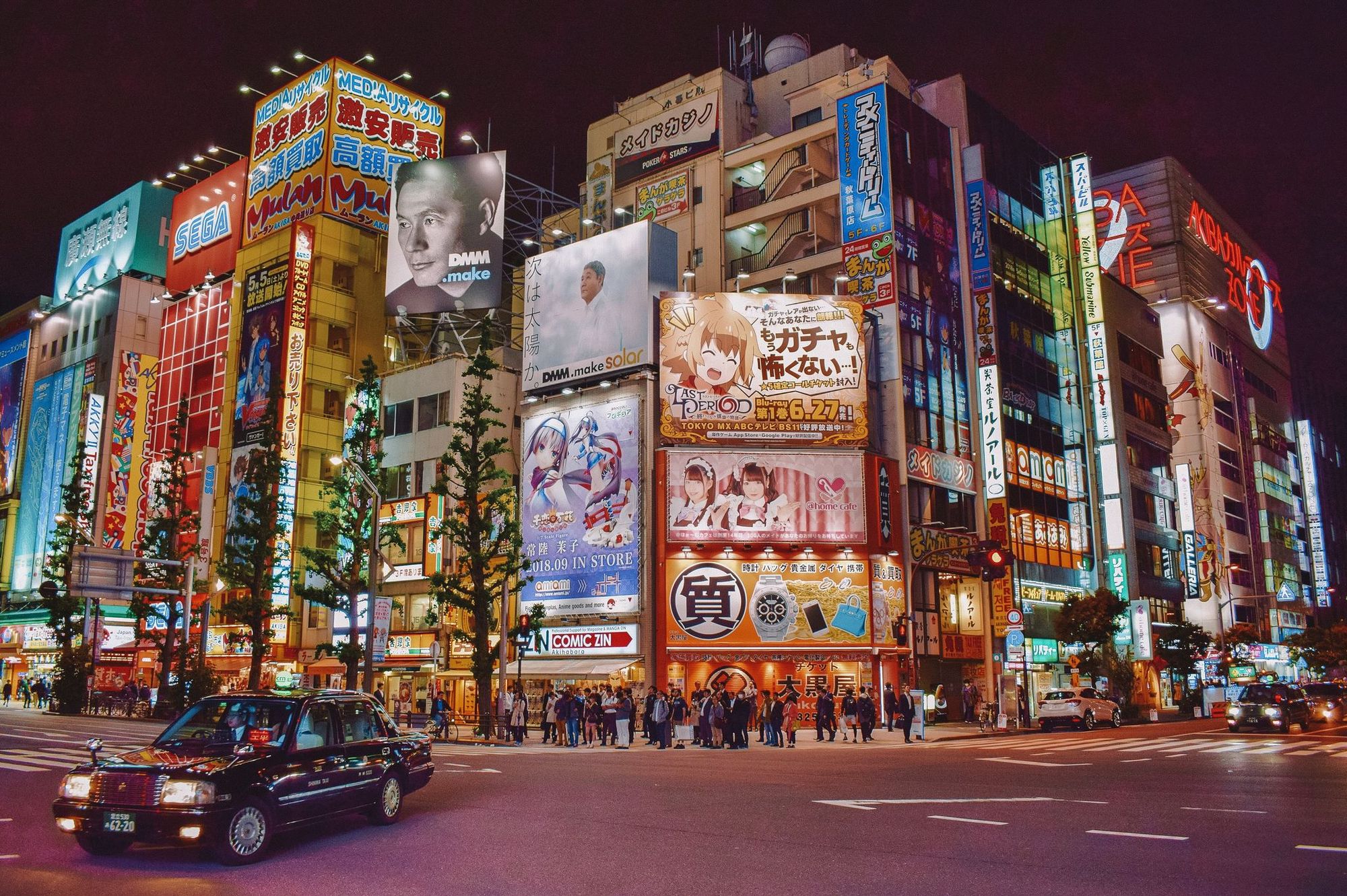
Responsive images
Responsive images are essential to modern web design, allowing images to adapt and display optimally across different devices and screen sizes.
They are used to ensure that images on a website are displayed in the appropriate size and resolution based on the user's device, whether it's a desktop computer, tablet, or mobile phone.
By using responsive images, web designers can improve the website's performance and user experience by delivering the most suitable image versions, reducing page load times, and ensuring images look crisp and visually appealing on all devices. There are 3 image types: regular (70% of the container width), wide (100% of the container width) and full width (full screen).
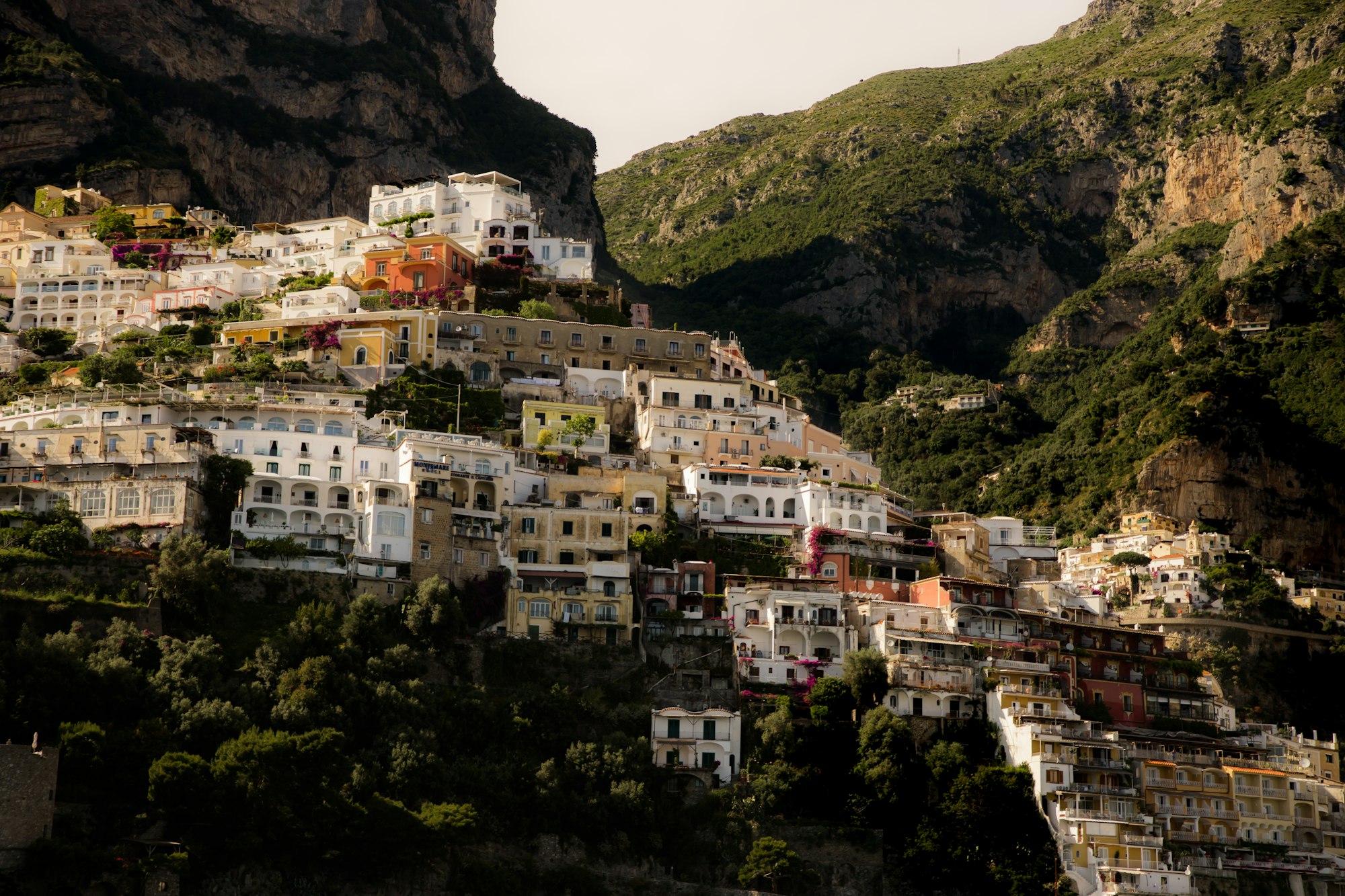


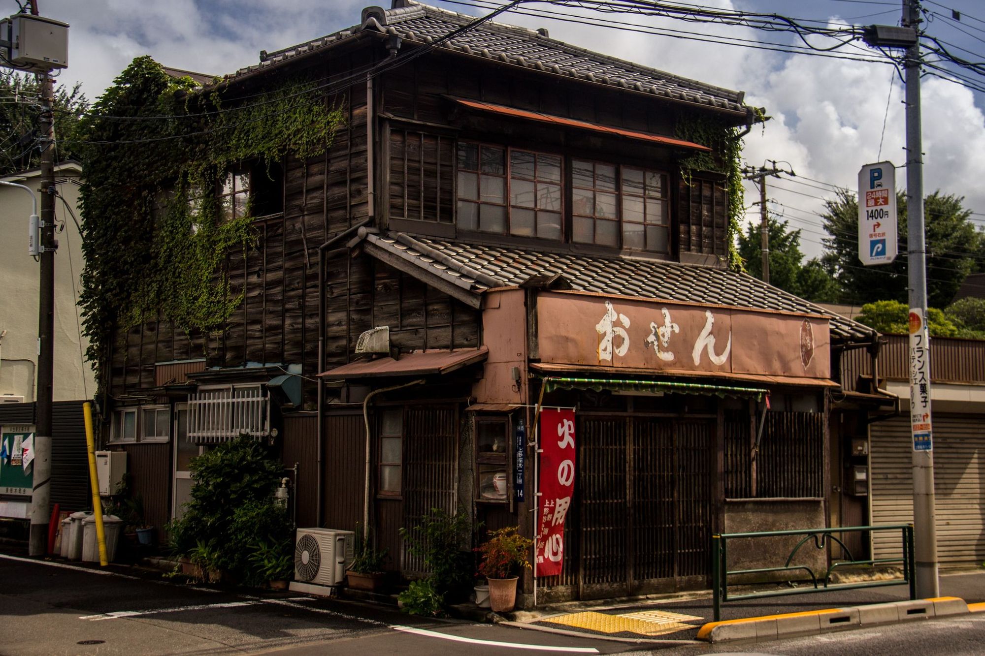
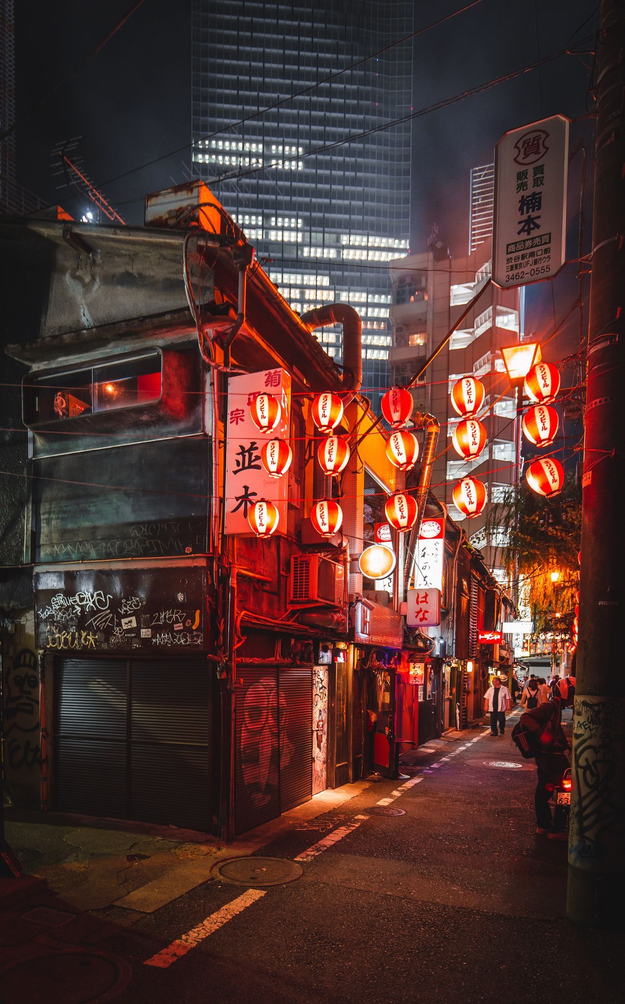
Image Gallery
An image gallery is a collection of multiple images presented together in a visually appealing and organized manner. It provides a convenient way to showcase and browse through a set of images, allowing users to view them in a structured and interactive format. They enhance the user experience by providing an intuitive and engaging way to explore and interact with the images which enlarge on click.


Quotes
Quotes are short excerpts or statements that are attributed to a specific source, such as an individual, book, or speech. They are used to provide impactful and memorable insights, opinions, or ideas within a text. Quotes can serve various purposes, including adding credibility, emphasizing key points, inspiring readers, or creating an emotional connection. They are often presented in a visually distinct format, such as with quotation marks or in a separate block, to draw attention and highlight their significance.
Lectus tortor habitant diam eget lacus pulvinar mattis. Adipiscing volutpat nisl viverra molestie vulputate convallis aliquam. Risus risus mauris proin aliquam sed nisl scelerisque.
“Lectus tortor habitant diam eget lacus pulvinar mattis. Adipiscing volutpat nisl viverra molestie vulputate convallis aliquam. Risus risus mauris proin aliquam sed nisl scelerisque.”
Lists
Lists are used to present information in an organized and structured manner. They provide a sequential or unordered collection of items, each displayed on a separate line or bullet point. Lists can be used to highlight key points, outline steps or instructions, present options or choices, or simply organize content in a clear and concise manner. They enhance readability and help readers navigate through information effectively, making them a valuable tool for presenting information in a concise and scannable format.
- A eget tristique facilisi tincidunt pellentesque dui. Elementum ridiculus erat faucibus elit blandit.
- Eget hendrerit sed in dui mattis magna libero. Ultricies consectetur morbi consequat viverra pretium.
- Phasellus quisque a facilisis elit donec morbi eu quisque facilisis. Arcu fringilla aliquam in in.
- Tellus sed tempus interdum egestas turpis vitae libero amet pharetra. Ut commodo nibh et egestas.
Uploads (video, audio, file)
With Zenith, you can effortlessly share and display videos, audio tracks, and files, enabling you to create engaging and interactive content experiences for your audience. There are 3 video types: regular (70% of the container width), wide (100% of the container width) and full width (full screen).
Chilled acoustic indie folk ig version 60s 96480:00/0:571×
Callouts
Callouts are a powerful tool to highlight and draw attention to important information on your website.
Callouts provide a visually appealing way to make your content stand out, whether it's a special announcement, a key message, or an attention-grabbing quote. With customizable styles and design elements, you can create engaging callouts that leave a lasting impression on your audience.
Toggles
Toggles are a versatile and interactive element that allows you to hide or show content with a single click.
They provide a compact and user-friendly way to present additional information, FAQs, or collapsible sections on your website. With Zenith, you can easily create toggles that enhance the user experience and make your content more organized and accessible.
Nulla suspendisse ridiculus amet interdum?
Mollis elementum vitae commodo in. Est fames suscipit ut sapien. Vehicula a nam pulvinar nunc tristique quam quis. In erat libero nisl nulla ullamcorper lectus. Rhoncus tincidunt aenean pellentesque egestas hendrerit. Volutpat sit quis donec justo sit ut. Elit a faucibus rutrum fringilla. Molestie lectus sed consectetur faucibus cursus. Mollis gravida sit congue ultrices quam pretium. Sed non auctor ultricies tincidunt in cursus urna in in. Enim euismod consectetur tempus fames amet et auctor. Pretium tincidunt viverra blandit lorem vulputate nibh sociis. Ipsum euismod ac vehicula in diam nec condimentum egestas. Eleifend fames adipiscing donec pellentesque ligula condimentum. Habitant imperdiet in in quisque eu faucibus habitasse quis.
Id iaculis mauris mattis leo cursus mattis?
Mollis elementum vitae commodo in. Est fames suscipit ut sapien. Vehicula a nam pulvinar nunc tristique quam quis. In erat libero nisl nulla ullamcorper lectus. Rhoncus tincidunt aenean pellentesque egestas hendrerit. Volutpat sit quis donec justo sit ut. Elit a faucibus rutrum fringilla. Molestie lectus sed consectetur faucibus cursus. Mollis gravida sit congue ultrices quam pretium. Sed non auctor ultricies tincidunt in cursus urna in in. Enim euismod consectetur tempus fames amet et auctor. Pretium tincidunt viverra blandit lorem vulputate nibh sociis. Ipsum euismod ac vehicula in diam nec condimentum egestas. Eleifend fames adipiscing donec pellentesque ligula condimentum. Habitant imperdiet in in quisque eu faucibus habitasse quis.
Donec blandit convallis dignissim non cras?
Mollis elementum vitae commodo in. Est fames suscipit ut sapien. Vehicula a nam pulvinar nunc tristique quam quis. In erat libero nisl nulla ullamcorper lectus. Rhoncus tincidunt aenean pellentesque egestas hendrerit. Volutpat sit quis donec justo sit ut. Elit a faucibus rutrum fringilla. Molestie lectus sed consectetur faucibus cursus. Mollis gravida sit congue ultrices quam pretium. Sed non auctor ultricies tincidunt in cursus urna in in. Enim euismod consectetur tempus fames amet et auctor. Pretium tincidunt viverra blandit lorem vulputate nibh sociis. Ipsum euismod ac vehicula in diam nec condimentum egestas. Eleifend fames adipiscing donec pellentesque ligula condimentum. Habitant imperdiet in in quisque eu faucibus habitasse quis.
Bookmarks
Bookmarks are a convenient feature that allows users to save and quickly access specific sections or pages within a website. With Zenith, you can easily implement bookmarks, enabling users to mark important or frequently visited content for easy reference.
 Trong Nguyen
Product
The product element empowers you to showcase and highlight your featured products. With a clean and elegant design, this element allows you to display product image, description and additional details in a visually appealing manner. .
Responsive Tables
| # | Heading | Heading | Heading | Heading | Heading |
|---|---|---|---|---|---|
| 1 | Cell text that you wrote | Cell text that you wrote | Cell text that you wrote | Cell text that you wrote | Cell text that you wrote |
| 2 | Cell | Cell | Cell | Cell | Cell |
| 3 | Cell | Cell | Cell | Cell | Cell |
Headers
Headers offer a versatile way to structure and organize your content. With different heading levels, you can create clear and hierarchical sections, making it easier for readers to navigate and comprehend your blog or website.
“I feel sorry for those people who know exactly what they want to be at 19.”
— Phil Knight (The founder of Nike)
Button text“I feel sorry for those people who know exactly what they want to be at 19.”
— Phil Knight (The founder of Nike)
Button textSubscription Box
Embeds
Zenith theme supports embeds: videos (such as Youtube and Vimeo), images from Unsplash, Spotify, Soundcloud, Codepen and Twitter posts.
when i say i use figma for everything, i mean everything. pic.twitter.com/pwANR6oWCY
— alexey (@sekachov) September 14, 2023
Syntax Highlight
.site {
    display: flex;
    flex-direction: column;
    min-height: 100vh;
}

.site-content {
    flex-grow: 1;
    padding: 6vmin 0 6vmin 0;
}

.is-head-brand .site-content {
    padding-top: max(8vmin, 5rem);
}

.pswp__bg {
    background-color: rgb(255 255 255 / 1) !important;
}